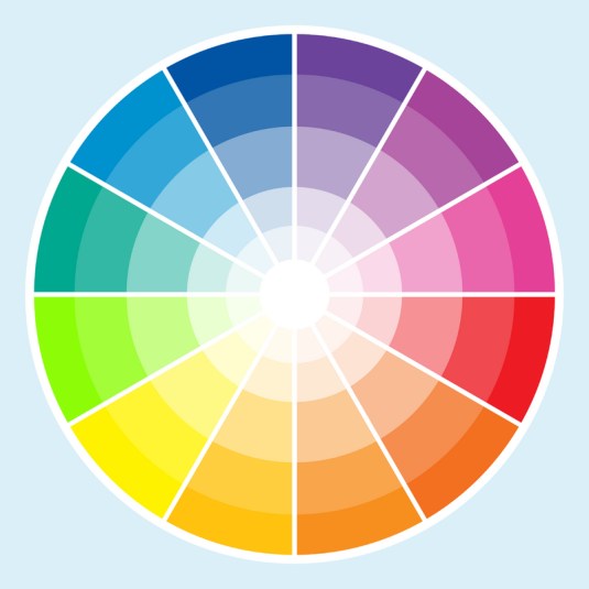
You may not realize the message that the clothes you’re wearing give or the feeling the paint on your walls stirs up, but every colour has immense power.
Think about your wardrobe. I bet there are colours that you’re drawn to and ones that you won’t go near. And your home? Do you surround yourself with warm, enveloping colours or bright, stimulating pigments?
Studies show that certain colours evoke certain emotions:
– Blue food or food on a blue plate registers as unappetizing.
– Although yellow is a primary colour, it’s the hardest one for your eyes to focus on. According to BasicTips.com, “It triggers the following emotions: intelligence, joy, and organization. Its opposite effects when used in the wrong manner or with the wrong combination of other colors can create feelings of criticism, laziness, or cynicism. Splashes of pale yellow is the best choice since many tones/shades of yellow are difficult for the human eye to focus on for very long. However, if used with short burst of text as a background, it grabs your attention and helps hold what you read in your memory banks.”
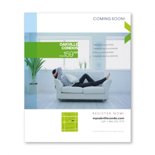
This is very important to us and our clients. We have to assess which colours should be used for each campaign. If we want to evoke young and sexy, should we be going with the tried and true black and red combination, or does the younger generation prefer colours like pink and grey? What colours make people think of luxury? What colours evoke a feeling of a good deal for your money?
With every client, we think about the product and the audience and choose colours accordingly.
So next time you’re drawn to a pizza poster, think about it – is it the picture of the pizza or the colours used in the ad that are pulling you in?


