I’m happy and honoured to report that our longtime client Mason Homes just won five awards at the Peterborough & The Kawarthas Home Builders Association’s 2011 Kawartha Awards of Distinction.

The Port Hope Golf & Country Club logo. We used blue throughout the entire campaign to echo the nearby lake and to inspire a sense of fulfillment and peace.
The awards are:
- Best Tract Built Home over 1,500 sq. ft. (the Monarch)
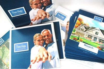
- Best Sales Brochure
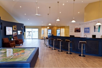
- Best New Home Sales Office
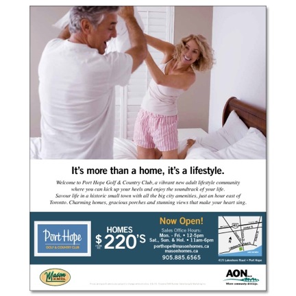
- Best Print Ad Campaign
- Best Project Logo Design & Signage
All five awards are for Mason Homes’ Port Hope Golf & Country Club community, for which BAM designed the entire campaign.

Port Hope Golf & Country Club’s active adult homebuyers know it’s never too late to have fun — an idea we expressed throughout the entire campaign.
How we did it
Having decided to target empty nesters, we designed everything (from the categories recognized above to the homes themselves) so that it would reflect the fulfillment of our demographic’s needs and desires.

The brochure matches the logo and overall community design in its simplicity (as well as the use of blue).
Knowing most people at that stage in their lives value straightforward recreation, we stuck to a simple, yet elegant design philosophy.
The overall effect is accessible, casual, and friendly — one that represents a carefree life in a safe space.
(We also embraced a musical theme throughout the project, peppering the website, brochure, and sales office with lyrics from classic songs. As well, we ventured into the realm of touchscreens when we opened the Presentation Centre, an event I blogged about here.)

The sales office is elegant, yet understated and tasteful. We used modern touchscreens, which has been a huge hit with homebuyers. The curving walls and desk are inspired by the community’s musical theme.
BAM and Mason Homes have put a lot of work into this community and it’s thrilling to see it recognized.

